Health Harmony Creative Process & Early Concept Drawings

Creation Process
What I focused on while developing my user stories
User Pain Points
Managing the day-to-day aspects of chronic care and/or complex illness often requires managing many different medications, data from several sources, and different appointments. Additionally, because having a chronic illness is lifelong, there will inevitably be ebbs and flows in commitment.
As someone with a complex illness and chronic illness, I understand many of the challenges that come with trying to manage the day-to-day treatment and I know that it is often quite boring. Knowing this, the product would have an element of fun and encourage positive behavior, while still capturing the needed information.
User Personas
While I primarily utilized myself as the user, I was also thinking about other people in my life who would benefit from an application like this. People who are both technologically savvy and those who are not. My primary user is anyone who has a chronic condition or a complex medical condition.
As I was thinking about users, I also wanted to consider the long-term potential of the product. This includes adding a new user type called "Caregiver" who would have the power to manage care records for other individuals such as minor children or elderly adults.
The Three Pillars of the Application
While thinking about the most important things to keep track of when managing a complex care condition, I wanted to start by keeping it very simple for my MVP (minimal viable product). I wanted the individual to be able to build a comprehensive Health Profile, manage their Care Team, and manage their medications. Medications and Care Team would also be able to be tied together so you can know which medications were prescribed by which provider and have a more holistic view of your personal treatment plan.
The Health Profile is another critical component and puts the user in full control of their health history. It would be designed to answer all of those questions you get asked whenever you go to a new provider's office as well as hold a record of important events, such as surgeries. Because filling out health history can be a time-consuming task, the application encourages the user to do it in phases to not be overwhelmed or discouraged.
Mobile First Design
While thinking through the technical aspects of this application, I concluded that this would have to be a Mobile First application. As the primary user is the individual with the disease, I wanted to make sure that they had their health information at their fingertips whenever and wherever they needed it. Going mobile-first does pose some challenges, especially handling some of the more robust features planned for the future, but ultimately it is the right thing for the user.
The other implication of going mobile first is that it also encourages a more streamlined look and feel. As I mentioned previously, I want to make sure that this application is easy to utilize for a wide range of users with varying levels of technical skills. My goal in keeping the design more streamlined is that the application is more intuitive to utilize.
Concept Drawings
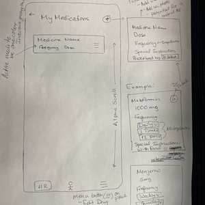
I have been working very closely with my tech co-founder to do a significant amount of discovery. As part of the process, I developed these concept drawings to help communicate what I'm looking to accomplish and clearly define my vision.


